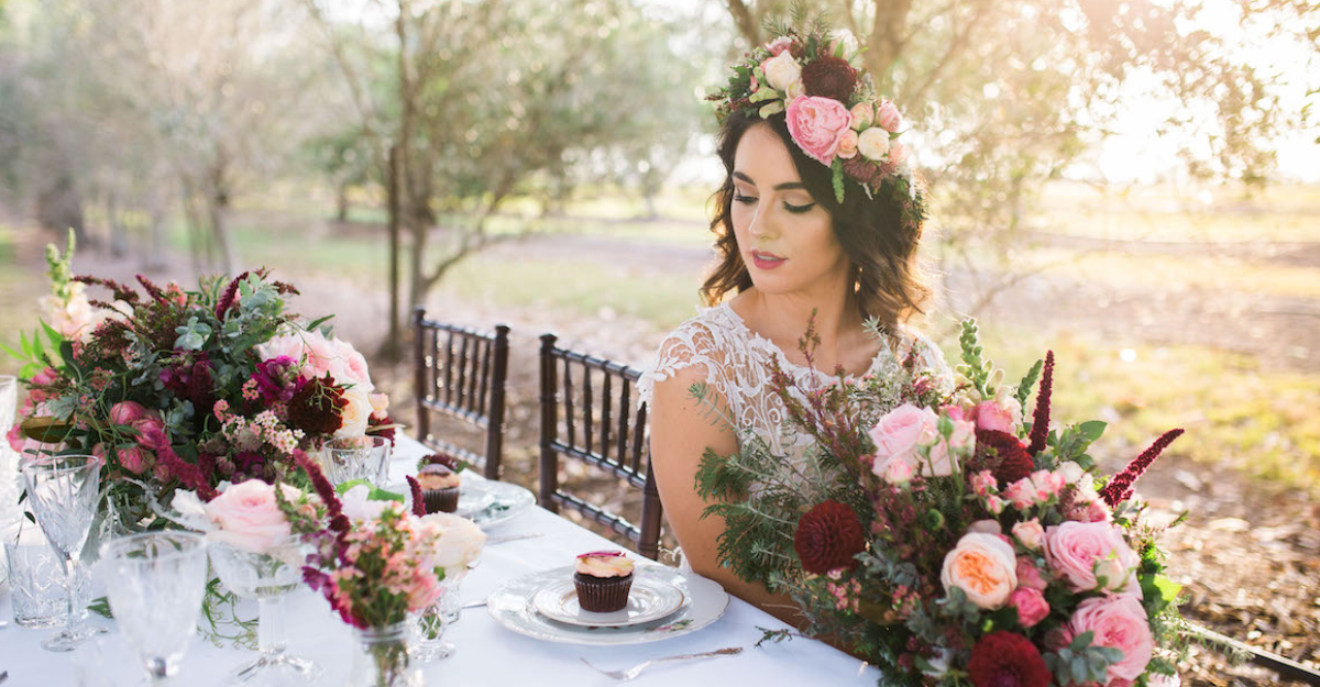
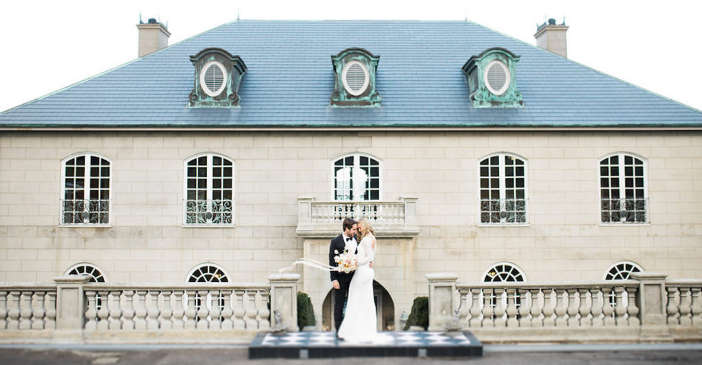
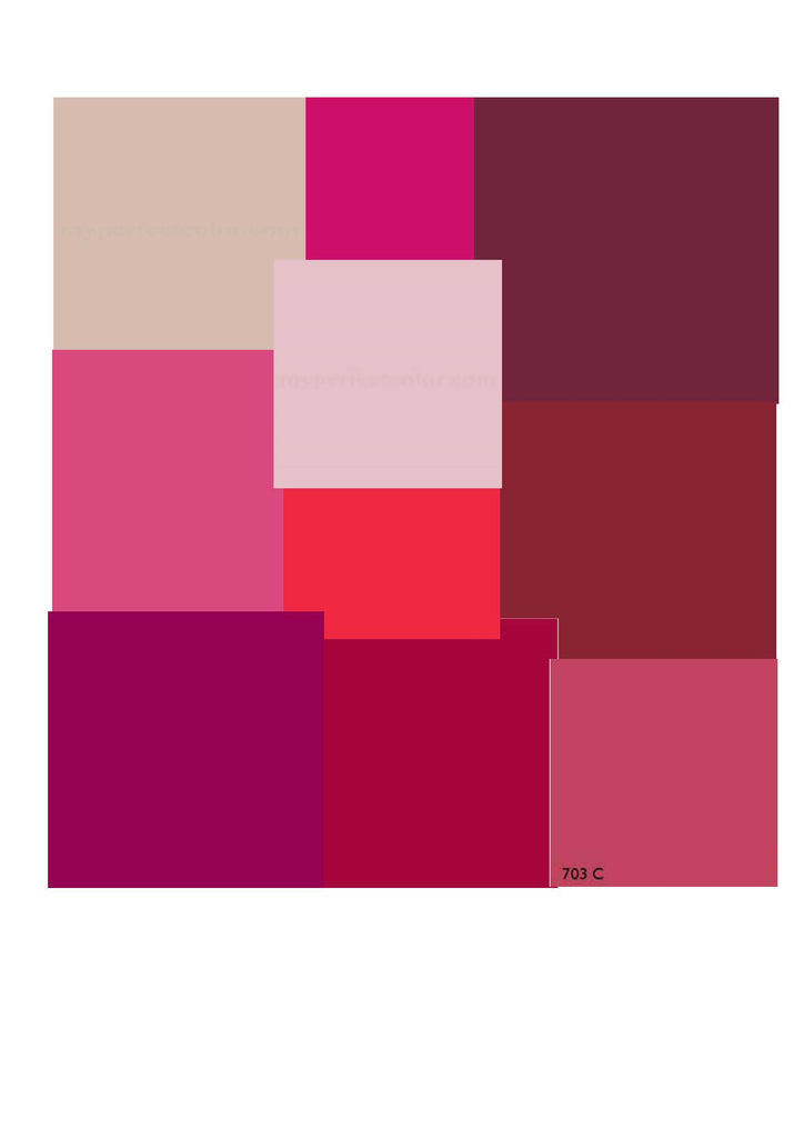
Held in the enchanting Quat Quatta in Ripponlea, Penny and Patrick celebrated their autumn wedding in splendid style. The canvas of their special day was painted with a mesmerising colour palette, encompassing blush pinks, deep plums, and vibrant coral tones.
With great delight, we embarked on a mission of collaborating with Penny and Patrick to bring their vision to life. Our task? Designing tent-fold place cards that harmonised with the rich autumnal hues that defined their April wedding.
Every detail was meticulously curated to ensure the place cards reflected the warmth and beauty of the wedding theme. From selecting the perfect colour to finding the right font, our aim was to create pops of colour to complement the white tablescapes.
Being part of Penny and Patrick’s wedding journey was an absolute pleasure! And seeing the place cards complement their wedding styling was a true delight.
Elsa Campbell Photography captured the essence of the wedding perfectly and has kindly shared some photos with us.

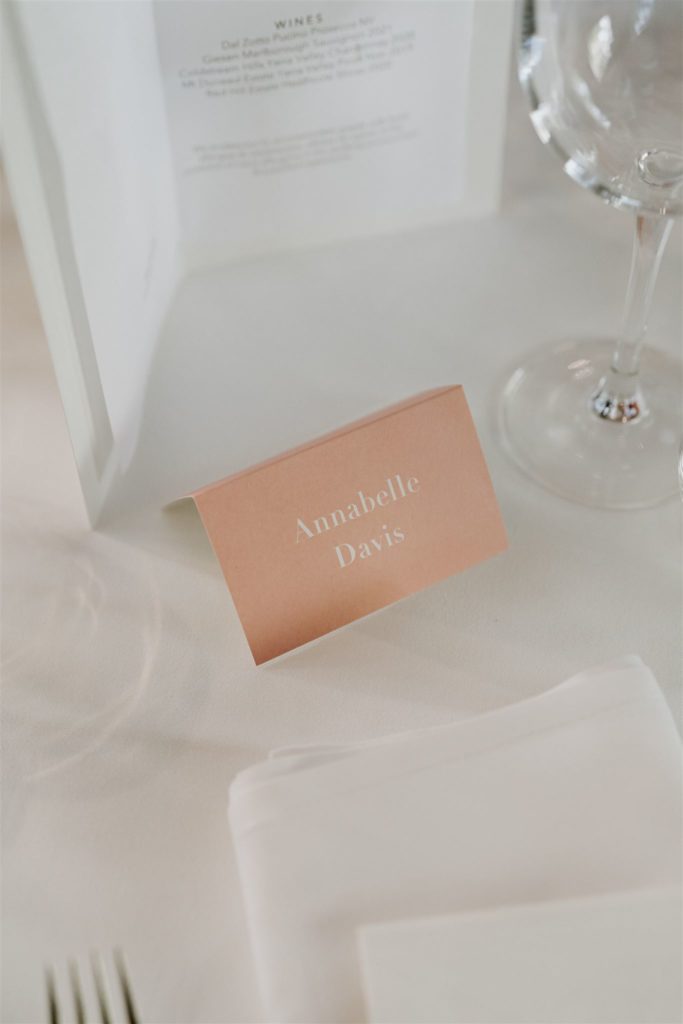
The Place Cards
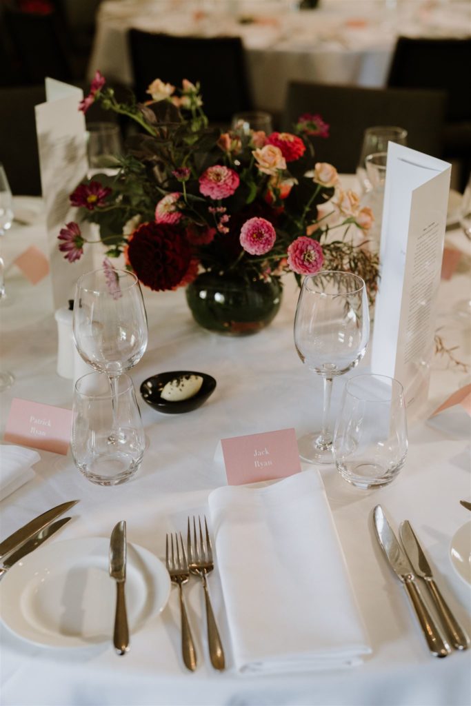
Penny approached us with a request to help create wedding place cards that would complement her wedding colour palette. Penny’s chosen hues of dusty rose, burgundy, and blush pink served as our inspiration, propelling us to breathe life into her vision.
Taking Penny’s provided colour palette as our guide, we enthusiastically set to work. We created several drafts with various colour options. Each design was thoughtfully curated, considering different colour combinations to find the ideal balance that would match the overall aesthetic of her special day.
We were excited to collaborate with Penny, ensuring that every detail throughout the creative process aligned with her vision. Witnessing her excitement and appreciation as we explored different colour variations was truly rewarding.
We took inspiration from the colour palette and created 10 unique designs and mockups for Penny to evaluate. It was essential to us that Penny had the opportunity to select her favourite among the options presented.
To our delight, Penny shared our enthusiasm for the blush pink design with white text. We both agreed that it was the perfect choice for the colour scheme of the place cards.

The Printing
White text with blush pink can be a bit tricky when it comes to visibility. So, we made sure to print colour swatch tests before committing to the final colour. In the samples, we found that the typography was too fine, so we tweaked it to be readable from afar.
Based on our experience, it’s best to get samples of your place cards printed before the final run. This is particularly important for larger quantities, such as over 100. This step helps prevent the need for costly reprints if issues arise, like unreadable text.
By taking the time to print and review samples, you can carefully assess the clarity, legibility, and overall quality of the printed text. This allows for necessary adjustments or corrections before committing to a full production run. It ensures confidence in the final outcome, avoiding any disappointments or surprises on your event day.
Ultimately, dedicating a little extra time and effort to sample printing brings peace of mind, ensuring the place cards are done right. It’s a simple but crucial measure that saves both time and resources in the long run.
In the end, it all came together nicely on the day and we absolutely love the softness of the blush pink place cards around the gorgeous deep-hued flowers.


—
The Hello Bureau is a creative design studio in Perth, Australia specialising in wedding and event stationery. With over 10 years experience in the industry, we seek to share our knowledge to help you with your creative wedding and event stationery projects. If you’re interested in bespoke stationery for your wedding or event, please send us an enquiry.