This article was last updated on 06/12/2024.
Have you ever wondered why some print shops ask for your document to be in CMYK? What does that even mean? For those who are not familiar with pre-press (the process of preparing digital files or artwork for printing) this can be a tad confusing. Let’s go through the basic differences between CMYK and RGB colour modes in this article.
Understanding CMYK and RGB Colour Modes
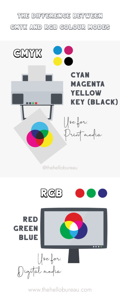
To understand CMYK and RGB colour modes, it’s important to first grasp the concept of colour itself. Colours are created by mixing different wavelengths of light or by subtracting certain wavelengths from white light. In the world of digital design and photography, the RGB colour model is commonly used. RGB stands for Red, Green, and Blue, which are the primary colours of light. By combining different intensities of these three colours, a wide range of colours can be achieved.
On the other hand, CMYK is the primary colour model used in printing. CMYK stands for Cyan, Magenta, Yellow, and Key (Black). Unlike RGB, which is an additive colour model, CMYK is a subtractive colour model. This means that when you combine the three primary colours (Cyan, Magenta, and Yellow) together, they absorb more light and result in a darker colour. The addition of Black (Key) is necessary to create deeper shades and enhance contrast in printed materials.
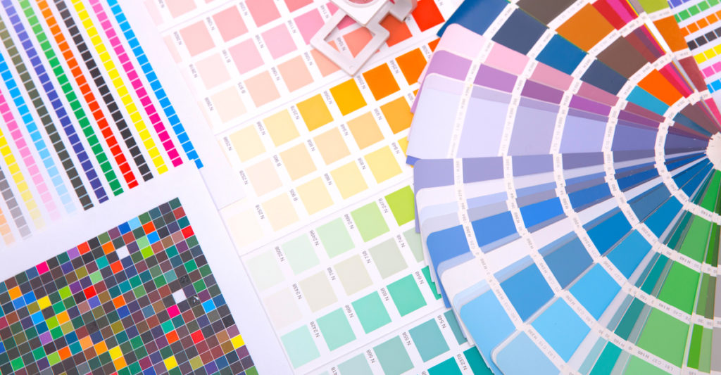
Don’t Trust the Colours on Your Monitor
When it comes to printing, one important thing to remember is that the colours on the printed item will never look exactly like they do on screen. As previously mentioned, this is because our screens use a different colour spectrum from printers.
The Difference Between CMYK and RGB
The main difference between CMYK and RGB colour modes lies in their applications and the way colours are represented. RGB is ideal for digital media, such as websites, social media graphics, and digital displays. This is because it accurately represents the colours that can be emitted by electronic devices. On the contrary, CMYK is best suited for print media, including brochures, magazines, and packaging, as it simulates the colours that can be produced by ink on paper.
Another key distinction is the colour gamut, which refers to the range of colours that can be reproduced in a particular colour mode. RGB has a wider colour gamut compared to CMYK, meaning it can display more vibrant and saturated colours. This is due to electronic devices emitting light directly, allowing for a broader spectrum of colours. CMYK has a more limited colour gamut due to the nature of ink and paper, resulting in slightly duller and less vibrant colours.
When to Use CMYK Colour Mode
CMYK colour mode is essential when working on designs intended for print. This includes anything from business cards and posters to brochures and packaging. When you design in CMYK, you can ensure that the colours you choose will be accurately reproduced when printed. This is crucial because the printing process involves applying ink to paper, and the final result may differ slightly from what is on your screen.
It’s important to note that when designing for CMYK, you need to consider the limitations of the printing process. Some colours that are easily achievable in RGB may be difficult or impossible to reproduce in CMYK. Bright neon colours, for example, often cannot be accurately reproduced in print. It is advisable to consult a print professional or use a colour guide to ensure accurate colour matching.

When to Use RGB Colour Mode
RGB colour mode is the go-to choice for designs intended for digital media. From websites and social media graphics to digital advertisements and presentations, RGB ensures that your colours will be accurately displayed on electronic devices. This allows for greater colour accuracy and vibrancy.
When working in RGB, you have access to a wider range of colours, including highly saturated tones. This opens up more creative possibilities, especially when designing for digital platforms that support a wide colour gamut. However, it’s important to keep in mind that colours that look vibrant on your screen may appear different on other devices. Therefore, it’s a good practice to calibrate your monitor and regularly check your designs on different devices to ensure colour consistency across platforms.
Summary
In conclusion, understanding the differences between CMYK and RGB colour modes is important for anyone involved in the world of printing and digital design.
RGB, with its primary colours of Red, Green, and Blue, is perfectly suited for digital media. This colour mode accurately represents the colours emitted by electronic devices. On the other hand, CMYK, comprising Cyan, Magenta, Yellow, and Key (Black), is the go-to choice for print media. This colour mode simulates the colours produced by ink on paper.
It is important to acknowledge that colours displayed on screens will never precisely match their printed counterparts due to variations in colour spectrums. The RGB colour gamut is wider, resulting in more vibrant and saturated colours. CMYK has a more limited gamut, leading to slightly duller tones.